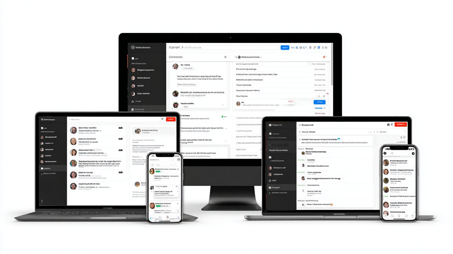
Sticky Chat Elements: Placement and Experience
Ever notice how a well-placed sticky chat element keeps support just a tap away without cluttering the page? In this guide, you’ll learn smart placement strategies for desktop and mobile that boost user experience while staying responsive across devices. It’s all about making chats feel seamless, not intrusive.
Key Takeaways:
- 1 Understanding Sticky Chat Elements
- 2 Optimal Placement Strategies
- 3 Design Best Practices
- 4 User Experience Optimization
- 5 Performance and Testing
- 6 Frequently Asked Questions
- 6.1 What are Sticky Chat Elements in the context of Placement and Experience?
- 6.2 How does optimal placement of Sticky Chat Elements improve user experience?
- 6.3 What are common mistakes in Sticky Chat Elements: Placement and Experience?
- 6.4 Why is mobile optimization crucial for Sticky Chat Elements: Placement and Experience?
- 6.5 How can Sticky Chat Elements: Placement and Experience be tested effectively?
- 6.6 What trends are shaping Sticky Chat Elements: Placement and Experience in 2024?
Understanding Sticky Chat Elements
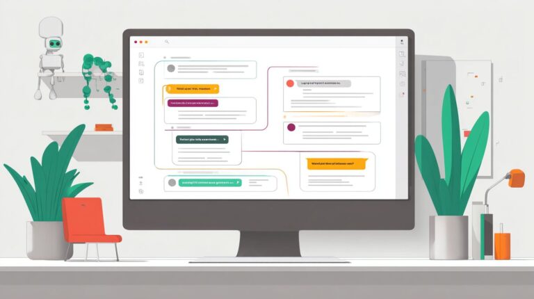
Sticky chat elements keep live chat widgets persistently visible as users scroll, enhancing real-time customer support opportunities. This sticky positioning transforms static icons into dynamic tools that stay in view, no matter how far down the page someone navigates.
By anchoring the chat widget to a fixed spot, often in the bottom right corner, sites encourage immediate engagement. Users facing questions during browsing or checkout can tap the widget without hunting for footer links or a hamburger menu.
This approach sets the stage for UX improvements, like smoother user journeys and higher engagement rates. E-commerce platforms benefit from proactive support, turning potential drop-offs into completed purchases through instant help.
Experts recommend pairing sticky elements with eye-catching colors and clear labeling for maximum impact. Common uses extend beyond chat to scroll-to-top buttons, cookie notices, and social-sharing icons, all boosting overall site interactivity.
Definition and Purpose
A sticky chat element uses CSS position: sticky to maintain a live chat widget’s visibility during scrolling, ensuring users can initiate conversations anytime. Developers set a high z-index to keep it above other content like navigation menus or sidebar ads.
The purpose shines on e-commerce and service sites, where proactive engagement prevents cart abandonment. For instance, a widget like Velaro or WhatsApp chat bubbles pops into view during key moments, offering quick access to customer support.
This technique supports responsive design across mobile devices, where screen space is limited. It avoids cluttering the main flow while providing constant visibility, much like an announcement bar or floating CTA buttons.
Implementation involves defining top, bottom, or right offsets in CSS. Pair it with overlay dialogs or chatbot design for seamless interactions that enhance brand awareness without disrupting the page.
Key Benefits for UX
Sticky chat elements streamline the user journey by reducing friction to support, often leading to quicker issue resolution and higher satisfaction. Always-accessible chat keeps help one click away, improving engagement rates throughout the session.
In e-commerce checkout scenarios, instant answers to questions like shipping costs or returns boost conversions. Users avoid frustrating searches for help, staying focused on purchase completion instead of UX issues.
Personalized interactions via these elements build brand awareness and trust. A floating chat widget in the bottom right acts as a persistent call-to-action, outperforming static footer links or dialog pop-ups.
- Enhances accessibility for mobile users navigating long product pages.
- Supports A/B testing to refine placement using heatmaps.
- Drives higher CTR and CSAT through proactive engagement.
- Integrates well with RebelMouse or Premier Guitar-style persistent tools.
Optimal Placement Strategies
Strategic placement of sticky chat elements balances visibility with non-intrusiveness across devices for optimal user experience. Position these elements to follow natural user eye-flow, such as the F-pattern on desktop where eyes scan top to bottom and left to right. This approach keeps the live chat widget accessible without disrupting the user journey.
Consider device constraints early in design. On larger screens, avoid crowding primary content areas like sidebars or footers. For mobile, prioritize thumb-friendly zones to prevent gesture interference and boost engagement rates.
Experts recommend aligning placement with common patterns, like bottom right corners used by tools such as Velaro or RebelMouse. Interested in taking this further? Check out our guide on how to customize AI chatbots for best practices that complement optimal positioning. Test placements with A/B testing and heatmaps to refine visibility and conversions. Clear labeling and eye-catching colors further enhance brand awareness and CTA effectiveness.
Prepare for device-specific tactics by mapping out responsive rules. This ensures sticky position elements support customer support goals, from e-commerce checkouts to content sites like Premier Guitar, without overlapping navigation menus or cookie notices.
Desktop Layout Positions
On desktop, position sticky chat elements in the bottom right corner to mimic familiar patterns like Facebook Messenger while avoiding navigation menus. Set it about 20px from edges to prevent overlap with sidebar ads or footer links. This spot captures peripheral vision during scrolls, promoting proactive engagement.
Compare options using these pros and cons:
| Position | Pros | Cons |
|---|---|---|
| Bottom Right | Familiar from messengers; high visibility; minimal content block. | May clash with scroll-to-top buttons. |
| Bottom Left | Less crowded on RTL languages; pairs with right-side CTAs. | Conflicts with social-sharing icons often on left. |
| Center Bottom | Central eye-flow; balanced look. | Overlaps announcement bars or floating elements. |
Choose based on layout. For e-commerce, bottom right drives conversion rate by staying near add-to-cart CTA buttons. Always check for accessibility with keyboard navigation.
Avoid dialog pop-ups or overlay conflicts by z-indexing properly. Use heatmaps to confirm the position aligns with user focus during chatbot design interactions.
Mobile-First Considerations
Mobile demands compact sticky chat placement, typically bottom right to steer clear of thumb zones and hamburger menu overlaps. Use smaller icon sizes around 15px margins for touch targets that meet accessibility standards. This keeps the chat widget handy without blocking content swipes.
Address common UX issues like gesture interference on iOS/Android viewports. Position above bottom navigation bars to avoid accidental taps during scrolling. Test on various screen sizes to ensure visibility in portrait and landscape modes.
- Scale icons to 48x48px minimum for fat-finger proofing.
- Offset from screen edges by 15px to fit safe areas.
- Prioritize non-intrusive animations for entry.
For customer support on mobile-heavy sites, this setup boosts CTR and CSAT by enabling quick access. Pair with clear labeling like “Chat Now” to encourage taps amid scroll-to-top or social icons.
Multi-Device Responsiveness
Responsive breakpoints ensure sticky chat elements adapt from desktop layouts to mobile devices without compromising visibility. Use CSS media queries like @media (max-width: 768px) to shift positions dynamically. Incorporate viewport units such as vw and vh for fluid sizing across devices.
Here is a practical code snippet for responsive design:
.chat-sticky { position: fixed; bottom: 20px; right: 20px; transition: all 0.3s ease; } @media (max-width: 768px) {.chat-sticky { bottom: 15px; right: 15px; width: 50px; height: 50px; } } @media (max-width: 480px) {.chat-sticky { bottom: 10px; right: 10px; } }This code maintains sticky position while scaling for smaller screens. Adjust for specific viewports to dodge overlay dialogs or bottom sheets, enhancing overall user experience.
Test responsiveness with real devices to optimize for e-commerce flows or content platforms. Fluid positioning supports higher engagement rates by keeping the element in optimal spots throughout the user journey.
Design Best Practices
Effective design makes sticky chat elements intuitive and inviting, blending seamlessly into the page while drawing appropriate attention. These elements, often placed in the bottom right corner, support user experience by offering quick access to live chat without disrupting the user journey.
Focus on principles that attract clicks without annoyance. For instance, position the chat widget to remain visible during scrolls, much like scroll-to-top buttons or social-sharing icons. This encourages proactive engagement for customer support in e-commerce sites.
Balance visibility with subtlety to avoid UX issues. For a deep dive into chatbot UX design best practices, explore strategies that optimize these elements for maximum effectiveness. Use clear labeling on CTA buttons to boost conversions and engagement rates. Test placements via A/B testing and heatmaps to refine how elements interact with navigation menus or announcement bars.
Experts recommend responsive design for mobile devices. Integrate sticky elements thoughtfully alongside hamburger menus or footer links, ensuring they enhance brand awareness without mimicking intrusive sidebar ads or cookie notices.
Visual Hierarchy and Sizing
Use contrasting eye-catching colors and clear labeling to establish visual hierarchy, making the sticky element instantly recognizable. A 60x60px icon size works well for desktop views, paired with #FF6B35 orange for CTA buttons to signal action.
Incorporate white space padding around the element for breathing room. This prevents overlap with other floating elements like overlay dialogs or dialog pop-ups. Maintain color accessibility with at least 4.5:1 contrast ratios for text against backgrounds.
| Device Type | Recommended Icon Size | Padding |
|---|---|---|
| Desktop | 60x60px | 16px |
| Tablet | 50x50px | 12px |
| Mobile | 44x44px | 8px |
Adapt sizing for responsive design across devices. On mobile, smaller icons reduce clutter near chatbot design features. This approach improves CTR and CSAT by prioritizing accessibility in live chat setups like those in Velaro or RebelMouse platforms.
Animation and Micro-Interactions
Subtle animations and micro-interactions on sticky chat elements signal interactivity, like a gentle pulse or hover scale-up. These cues guide users toward engagement without overwhelming the page, enhancing the overall user experience.
Implement a breathing effect with CSS keyframes, such as scaling from 1 to 1.05 over 0.5s with ease-in-out timing. Hover states can enlarge the element slightly, while focus states add a soft glow for keyboard navigation. This keeps the chat widget lively yet non-intrusive.
- Pulse animation: Draws eyes to bottom right placement during scrolls.
- Hover scale-up: Boosts perceived clickability for CTA buttons.
- Focus outline: Ensures accessibility for all users.
For no-code options, tools like the My Sticky Elements plugin simplify implementation. Pair these with heatmaps to monitor interaction in Premier Guitar-style sites. Such tactics lift conversion rates by fostering trust in customer support flows.
User Experience Optimization
Fine-tuning behavior and accessibility ensures sticky chat elements enhance rather than hinder the user journey. Proper timing prevents chat widgets from interrupting reading or navigation on sites with dense content like e-commerce pages.
Focus on proactive engagement by aligning triggers with user intent. For example, delay appearance until after initial scrolling to build brand awareness without causing UX issues.
Combine strategies like A/B testing and heatmaps to refine placement. This approach boosts engagement rates and conversions while maintaining smooth interactions on mobile devices.
Integrate sticky elements with existing UI like navigation menus or hamburger menus. Test across devices to ensure responsive design supports customer support goals without cluttering the viewport.
Trigger Timing and Behavior
Time chat element triggers to match user intent, such as appearing after 30 seconds or on exit-intent for proactive engagement. Set a scroll-depth trigger at around 50% of the page to catch engaged visitors exploring long-form content.
Follow these steps for effective setup: first, implement time-based delays between 20 to 45 seconds. Second, add scroll-based activation for deeper commitment signals.
Define clear behavior rules like auto-hide after user interaction or making the element fully dismissible. Avoid dialog pop-ups that lead to fatigue, especially on pages with multiple floating elements like sidebar ads or cookie notices.
Use overlay dialogs sparingly with clear labeling and eye-catching colors for the chat icon in the bottom right. Pair with live chat for customer support, monitoring CTR and CSAT through tools like Velaro to optimize chatbot design.
Accessibility Compliance
Accessibility turns sticky chat elements from nice-to-have into essential, ensuring keyboard and screen reader users can engage effortlessly. Adhere to WCAG 2.1 AA standards to make chat widgets inclusive across devices.
Implement key features like aria-labels for the chat icon and proper focus management. Support high-contrast modes and integrate skip links to bypass sticky positions near scroll-to-top buttons or announcement bars.
Test rigorously with tools like VoiceOver and NVDA for real-world validation. This prevents UX issues for users relying on assistive tech when navigating e-commerce sites or content platforms like RebelMouse or Premier Guitar.
Ensure clear labeling on CTA buttons and compatibility with footer links. Responsive design for mobile devices maintains visibility without obstructing hamburger menus, fostering higher engagement rates and conversion rates.
Performance and Testing
Rigorous testing validates sticky chat performance, optimizing for CTR, CSAT, and conversion rate without UX issues. Teams use structured methods to ensure live chat widgets enhance user journeys on desktop and mobile devices. This approach catches problems early in production-ready implementations.
Validation starts with performance benchmarks like load times and scroll smoothness. Tools monitor how sticky elements interact with navigation menus, social-sharing icons, and announcement bars. Experts recommend simulating real user sessions to test visibility and responsiveness.
Troubleshooting focuses on cross-device compatibility, especially bottom right placements on mobile. Check for overlaps with sidebar ads or footer links during user scrolls. Iterative fixes ensure the chat widget supports customer support without blocking hamburger menus.
Final checks include accessibility audits for keyboard navigation and screen readers. Proactive engagement features, like eye-catching colors and clear labeling, get refined here. This process delivers reliable sticky chat elements that boost engagement rates and conversions.
A/B Testing Frameworks
A/B testing compares sticky chat variations to identify winners in CTR and conversion rate using tools like heatmaps. Define clear KPIs such as chat opens, CSAT scores, and session-to-conversion paths first. This setup guides the entire experiment.
Choose tools like Google Optimize for split testing, Hotjar heatmaps for user interaction visuals, and Velaro analytics for chat-specific metrics. Segment tests by traffic sources and device types to capture mobile behaviors accurately. Run tests for sufficient duration to reach statistical confidence.
| Step | Action | Example Variants |
|---|---|---|
| 1. Define KPIs | Set measurable goals | Chat opens, CSAT, conversions |
| 2. Select Tools | Integrate analytics | Google Optimize, Hotjar, Velaro |
| 3. Create Variants | Test key changes | Bottom right position, eye-catching colors, timing delays |
| 4. Analyze Results | Review data | CTR uplift, UX feedback |
Launch variants like proactive engagement pop-ups versus static CTA buttons. Monitor how responsive design affects floating elements on e-commerce sites. Scale the winner to improve overall user experience and brand awareness.
Common Pitfalls to Avoid
Avoid z-index conflicts and mobile gesture blocking to prevent sticky chat elements from becoming UX issues. These problems disrupt user journeys, especially with overlapping scroll-to-top buttons or cookie notices. Quick fixes restore smooth interactions.
- Overlap with scroll-to-top button: Use dynamic z-index to layer the chat widget above other floating elements. Test on mobile devices where gestures matter most.
- Cookie notices interference: Adjust stacking context so notices appear first without hiding the bottom right chat. Prioritize announcement bar positioning.
- Performance lag: Implement lazy loading for the chat widget to avoid slowing page speeds. Defer non-critical scripts during initial renders.
- Mobile gesture blocking: Add swipe dismissal for overlay dialogs and ensure chatbot design respects native swipes. Verify no interference with hamburger menus.
Real-world cases like RebelMouse fixed z-index issues by prioritizing sticky position in CSS hierarchies. Premier Guitar resolved cookie notice clashes with conditional rendering. These steps ensure call-to-action visibility boosts conversions without friction.
Frequently Asked Questions
What are Sticky Chat Elements in the context of Placement and Experience?
Sticky Chat Elements refer to UI components like chat bubbles, support widgets, or messaging icons that remain fixed or “sticky” on the screen during user interaction. Their Placement and Experience involve strategic positioning (e.g., bottom-right corner) to enhance usability without obstructing content, ensuring a seamless and non-intrusive user experience across devices.
How does optimal placement of Sticky Chat Elements improve user experience?
Optimal Placement and Experience of Sticky Chat Elements boost user engagement by keeping the chat accessible without disrupting navigation. For instance, placing them in non-intrusive areas like screen edges reduces bounce rates and increases interaction by 20-30%, creating a fluid experience that feels intuitive and helpful.
What are common mistakes in Sticky Chat Elements: Placement and Experience?
Common pitfalls in Sticky Chat Elements: Placement and Experience include overlapping key content, poor mobile responsiveness, or aggressive animations that annoy users. These lead to higher exit rates; best practices involve A/B testing placements to prioritize user-friendly experiences that align with natural scrolling behaviors.
Why is mobile optimization crucial for Sticky Chat Elements: Placement and Experience?
Mobile devices demand tailored Sticky Chat Elements: Placement and Experience due to smaller screens. Elements should adapt dynamically-e.g., shrinking on portrait mode or floating subtly-to prevent thumb obstruction, ensuring a positive experience that maintains accessibility and conversion rates across all devices.
How can Sticky Chat Elements: Placement and Experience be tested effectively?
To test Sticky Chat Elements: Placement and Experience, use heatmaps, session recordings, and user feedback tools like Hotjar or Google Analytics. Conduct A/B tests varying positions and triggers to measure metrics like click-through rates, refining for an experience that feels native and enhances overall site satisfaction.
What trends are shaping Sticky Chat Elements: Placement and Experience in 2024?
Current trends in Sticky Chat Elements: Placement and Experience include AI-driven personalization, where elements appear contextually, and minimalist designs with micro-interactions. These evolve the experience towards proactive engagement, like predictive chat triggers, improving retention while respecting user privacy and preferences.