Sunburst Visualizations: Usage and Insights for Chatbots
Working with chatbot analytics and trying to make sense of complex conversation flows? Sunburst charts, with their concentric rings, offer a clear way to visualize hierarchical data like user journeys and drop-offs. You’ll see how they reveal key insights to improve your bots.
Key Takeaways:
- 1 Sunburst Fundamentals for Data Analysis
- 2 Chatbot Analytics Use Cases
- 3 Implementation in Chatbot Platforms
- 4 Key Insights from Sunburst Charts
- 5 Best Practices and Optimization
- 6 Frequently Asked Questions
- 6.1 What are Sunburst Visualizations and their primary usage in chatbots?
- 6.2 How do Sunburst Visualizations enhance insights for chatbot analytics?
- 6.3 What tools or libraries support creating Sunburst Visualizations for chatbots?
- 6.4 Can Sunburst Visualizations be interactive in chatbot interfaces?
- 6.5 What are common challenges when implementing Sunburst Visualizations in chatbots?
- 6.6 How do Sunburst Visualizations provide actionable insights for improving chatbots?
Core Structure and Design
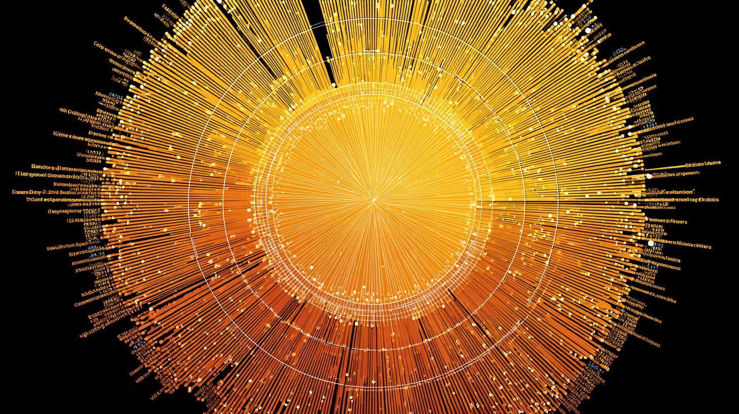
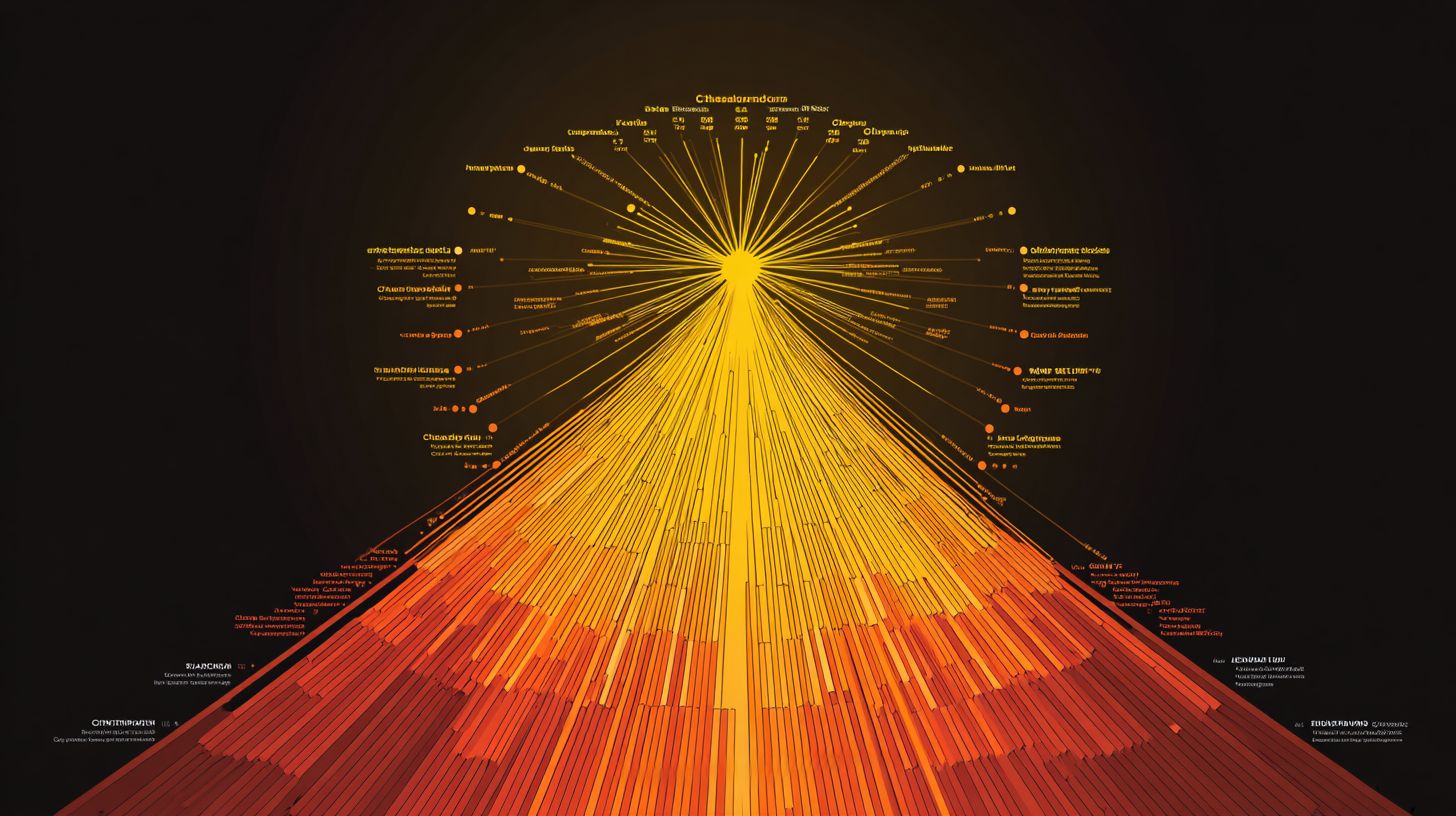
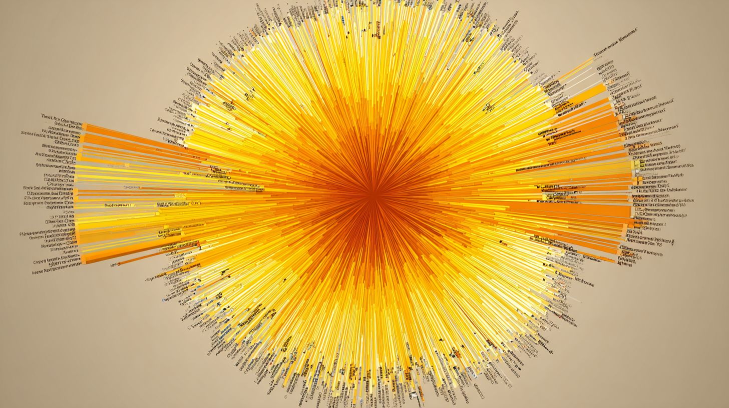
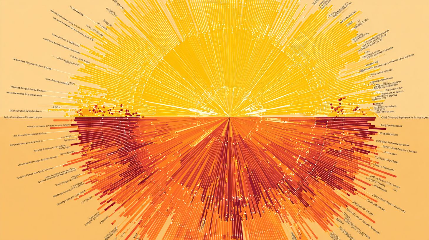
At the heart of every sunburst chart lies a root node that expands outward through nested concentric rings, each segment sized by its proportion in the data hierarchy. The innermost ring displays top-level categories, such as main chatbot conversation topics. Outer rings then drill into subcategories, revealing finer details like user intents or response types.
Arc lengths represent the proportional size of each category, making it easy to spot dominant areas in hierarchical data. For example, in a chatbot analytics dashboard, a large arc in the inner ring might show customer support queries, with outer segments breaking down into billing issues or product questions. This radial layout keeps the view compact compared to stacked pie charts.
Segment colors enhance data interpretation by grouping related child nodes under consistent hues from their parent nodes. Tools like Power BI or Excel allow customization with conditional formatting, ensuring visual appeal without clutter. Add tooltips and data labels for quick insights on hover.
Avoid common mistakes like overcrowding with too many levels, which harms data accuracy. Use drill down features and legends to maintain clarity in complex views, such as revenue breakdown or market segmentation for chatbot performance.
Sunburst Fundamentals for Data Analysis
Sunburst charts excel at revealing patterns in hierarchical data by mapping parent-child relationships across multiple levels in a single, intuitive view. Unlike flat visuals like bar charts, they use concentric rings to show nested structures, making it easier to spot trends in complex datasets. This approach outperforms pie charts for multi-level data by preserving proportions and context.
For analysts new to radial hierarchies, sunburst charts shine in scenarios like organizational structures or revenue breakdowns. The root node at the center branches into outer rings, where each segment’s size reflects its value relative to the whole. This design aids data interpretation by allowing quick scans of proportions across levels.
Tools like Excel, Power BI, and Zoho Analytics support sunburst creation with features such as drill down and conditional formatting. Customization options including colors, data labels, and legends enhance visual appeal. Experts recommend starting with clean data to leverage these charts’ strength in market segmentation and financial analysis.
Common advantages include better handling of multi-level hierarchies compared to treemaps, with tooltips providing on-hover details. Nested sorting ensures child nodes align logically under parent nodes. This makes sunburst charts ideal for chatbot insights into user interaction trees or conversation flows.
Hierarchical Data Representation
Each ring in a sunburst chart represents a level in your data hierarchy, with parent nodes containing proportionally sized child nodes that reveal deeper insights. Inner rings show high-level categories, while outer rings detail subcategories. This radial layout beats linear tables for grasping proportions at a glance.
To prepare data, structure it in a table with columns for Category, Subcategory, and Values. For example, use Region > Product > Sales where “North America” is a parent to products like “Widget A”. Maintain data accuracy by validating entries before import into tools like PowerViz or InetSoft.
- Identify the root node as your top-level category, such as regions.
- Nest subcategories under parents using consistent naming.
- Assign values to the deepest level for accurate segment sizing.
- Apply nested sorting to rank child nodes by value within each parent.
Avoid common mistakes like mismatched levels, which distort rings. Use intelligent ranking in EdrawMind or Lumel for optimal order. Test with sample data to ensure smooth data visualization and reliable insights.
Chatbot Analytics Use Cases
Chatbot teams use sunburst charts to visualize complex conversation trees and user paths, quickly spotting engagement patterns across multi-step interactions. These hierarchical data tools display concentric rings with a central root node expanding into outer rings for child nodes. Product managers gain clear insights into user drop-offs.
Conversation designers benefit from the visual appeal of sunburst charts over traditional pie charts. They reveal data hierarchy in multi-level structures, making data interpretation straightforward. Teams can customize colors and segments for better readability in tools like Power BI or Excel.
For chatbot optimization, sunburst charts highlight parent nodes and their nested child nodes. Enable drill down features and tooltips for detailed views. This approach aids in refining flows and improving user retention.
Common applications include mapping organizational structures of dialogues or segmenting user behaviors. Product managers use proportions in rings to assess conversation health. Designers avoid overcrowding by applying conditional formatting and data labels.
Conversation Flow Mapping
Map your chatbot’s conversation tree with the root node as the welcome message, branching into intent nodes, then specific response paths in outer rings. This sunburst chart structure shows the full data hierarchy from inner rings to outer ones. Hover tooltips reveal conversation counts at each level.
Consider a flow like Welcome > Greeting Intent > User responds > Fallback path. Click to drill down and isolate underperforming branches. Use colors and legends to differentiate healthy paths from drop-offs.
Avoid common mistakes like overcrowding rings, which muddle data accuracy. Apply nested sorting or intelligent ranking to prioritize key segments. Add annotations for context on complex interactions.
Customization in tools like Zoho Analytics or PowerViz enhances usability. Enable data labels on arcs for quick scans. This setup enables designers to optimize flow complexity effectively.
User Journey Segmentation
Segment user journeys by source > intent > outcome to see which paths convert visitors into qualified leads versus drop-offs. Sunburst visualizations use arc proportions to display drop-off severity at each level. Color code by conversion success for instant insights.
Structure as Traffic Source > First Intent > Resolution Type > Completion Status. Inner rings show broad categories, outer rings detail endpoints. Tooltips provide interaction metrics on hover.
Product managers spot bottlenecks in multi-level hierarchies this way. Use conditional formatting to highlight poor performers in red tones. Legends clarify segment meanings across the chart.
For advanced use, work together with Inriver Analytics or Lumel for seamless updates. Apply trellis views for side-by-side comparisons. This segmentation refines targeting and boosts engagement.
Implementation in Chatbot Platforms
Connect your chatbot data streams to visualization platforms like Power BI or Excel to generate interactive sunburst charts without coding. Platforms such as Dialogflow and Botpress offer no-code exports of conversation logs and user paths in hierarchical formats. This setup turns raw interaction data into visual data hierarchies with concentric rings.
Start by selecting sunburst-ready tools that match your platform’s output. For Dialogflow, use built-in analytics exports to feed into Power BI for real-time drill-down views of user journeys. Botpress users can pipe JSON data directly into Excel’s sunburst feature for quick multi-level breakdowns.
Custom APIs simplify integration for advanced needs. Connect Botpress webhooks to Power BI’s streaming dataset for live root node updates on conversation trees. No-code paths ensure data accuracy while highlighting parent-child relationships in outer and inner rings.
Avoid common mistakes like mismatched data structures by standardizing on ID-Path-Value columns first. This approach boosts data interpretation for chatbot optimization, revealing patterns in user segmentation similar to revenue breakdowns.
Integration with Analytics Tools
Export Region Sales.xlsx-style hierarchical data from your chatbot platform, then use Power BI’s Chart Designer or Excel’s built-in sunburst chart feature for instant visualization. Format data with ID-Path-Value columns in about two minutes to prepare conversation flows. This step ensures clean concentric rings for user path analysis.
Next, insert the sunburst chart in under thirty seconds using drag-and-drop interfaces. Connect to live chatbot APIs via Power BI Gateway for dynamic updates on child nodes and proportions. Excel shines for simplicity, while Power BI adds interactive tooltips.
Customize with colors, segments, and data labels to enhance visual appeal. Power BI supports drill down into nested levels, ideal for market segmentation in chatbot metrics. Compare tools below for the best fit.
| Tool | Key Features | Best For |
|---|---|---|
| Power BI | Drill-down, live API connections, conditional formatting | Real-time chatbot analytics |
| Excel | Simplicity, quick inserts, basic legends | One-off hierarchical reports |
| Inforiver | Advanced formatting, nested sorting, annotations | Complex data hierarchies |
Key Insights from Sunburst Charts
Sunburst charts reveal hidden bottlenecks in your data hierarchy through visual patterns that linear charts obscure. The concentric rings display parent nodes at the center and child nodes outward, making multi-level relationships clear at a glance. This data visualization beats traditional pie charts by showing nested proportions in one view.
Train your eye to read sunburst patterns effectively. Thin segments in the outer rings signal low engagement, often where users abandon chatbot flows. Unbalanced rings point to skewed priorities in the data hierarchy, like overemphasis on one conversation branch.
Cross-reference with drill down features and tooltips for deeper insights. Customize colors and conditional formatting to highlight issues, such as small outer segments compared to inner rings. Tools like Power BI or Excel support this for quick data interpretation.
For chatbot analysis, map user paths from root node to endpoints. Spot revenue breakdowns or market segmentation issues visually. Experts recommend pairing sunburst charts with legends and data labels for better organizational structures.
Drop-off Point Identification
Spot conversation drop-offs where outer ring segments shrink dramatically compared to healthy inner ring proportions. In a sunburst chart for chatbots, a thick inner ring for greetings might feed into tiny outer segments for follow-up queries. This visual cue reveals where users disengage in the hierarchy.
Apply conditional formatting to highlight segments much smaller than their parent nodes. Use tooltip metrics on hover to check exact proportions and session counts. This quick diagnosis pinpoints bottlenecks without sifting through raw data.
- Scan from root node outward for sudden shrinks in segment size.
- Activate drill down to inspect child nodes of suspect parents.
- Prioritize redesign for the top drop-off nodes, like simplifying complex query paths.
Test fixes by updating your sunburst chart in tools such as Zoho Analytics or PowerViz. Add annotations for context and nested sorting for intelligent ranking. This approach boosts data accuracy and refines chatbot flows over time.
Best Practices and Optimization
Maximize sunburst chart impact with smart customization that balances clarity, interactivity, and visual appeal. These visualizations excel at showing hierarchical data through concentric rings, but poor design can confuse users. Focus on techniques that enhance data interpretation without overwhelming the viewer.
Start by refining your data hierarchy to ensure parent nodes and child nodes connect logically. Tools like Power BI and Excel offer built-in options for customization, such as adjusting ring proportions. This approach improves readability for complex structures like revenue breakdowns or market segmentation.
Next, prioritize interactivity with features like drill-down and tooltips. Combine this with performance tweaks to handle large datasets smoothly. Experts recommend testing on multiple devices for consistent visual appeal.
Finally, address common pitfalls early by validating data accuracy and limiting hierarchy depth. These steps turn static pie charts alternatives into dynamic tools for financial analysis and organizational structures.
Design Optimization Techniques
Use the Color Shelf to differentiate parent nodes while maintaining segment readability through strategic data labels and legends. Limit your color palette to 6-8 hues to avoid the rainbow effect that muddles outer rings. This keeps focus on proportions in multi-level hierarchies.
Position data labels outside arcs for better visibility, especially on inner rings. Apply conditional formatting to highlight outliers, such as top-performing child nodes in a revenue breakdown. Hide legends when dealing with fewer than five categories to reduce clutter.
A common mistake is over-labeling tiny segments, which crowds the visualization. Instead, use tooltips for details on hover. In tools like Zoho Analytics or Inriver Analytics, these tweaks boost clarity for hierarchical data.
Test designs with sample datasets representing real scenarios, like market segmentation. This ensures visual appeal supports quick data interpretation across concentric rings.
Interactive Features for Deeper Analysis
Enable drill-down functionality so users click from broad revenue breakdown views into granular product performance across regions. In Power BI, activate hierarchy drill-through for seamless navigation from root node to outer rings. This reveals insights hidden in nested structures.
In Excel, integrate slicers to filter child nodes dynamically. Add intelligent ranking to sort outer rings by value descending, prioritizing key segments. These advanced features enhance exploration of organizational structures.
Incorporate tooltips with contextual info, like exact proportions or comparisons to parent nodes. Enable nested sorting for multi-level views, making financial analysis more intuitive. Platforms like Powerviz or Lumel support these for chatbot-driven insights.
Combine interactivity with annotations for guided analysis. Users gain deeper understanding of data hierarchies without prior expertise.
Common Pitfalls and Solutions
Avoid the most frequent sunburst chart failures by validating your data hierarchy before visualization. Here are top issues and fixes.
- Missing parent-child links: Use ID-path columns to connect nodes properly.
- Overly deep hierarchies beyond five levels: Switch to trellis views for better manageability.
- Poor mobile readability: Add annotations and scale rings responsively.
- Static charts lacking engagement: Enable interactivity like drill-down and tooltips.
- Ignoring data accuracy: Implement refresh validation to catch errors early.
Overlooking these leads to misinterpretation of concentric rings. Regularly audit your setup in tools like EdrawMind or Inetsoft.
Adopt these solutions to elevate your sunburst visualizations. They ensure reliable performance for hierarchical data in chatbot contexts.
Frequently Asked Questions
What are Sunburst Visualizations and their primary usage in chatbots?
Sunburst Visualizations: Usage and Insights for Chatbots involve hierarchical, radial charts that display data in concentric rings, with each ring representing a level in the hierarchy. In chatbots, they are used to visualize user interaction paths, conversation flows, or topic distributions, providing a compact way to show complex nested data like user journeys through menus or decision trees.
How do Sunburst Visualizations enhance insights for chatbot analytics?
Sunburst Visualizations: Usage and Insights for Chatbots allow developers to gain insights into user behavior by revealing patterns such as popular conversation branches, drop-off points, or dominant topics. The radial layout makes it easy to spot imbalances or bottlenecks in chatbot performance at a glance, aiding in optimization.
What tools or libraries support creating Sunburst Visualizations for chatbots?
For Sunburst Visualizations: Usage and Insights for Chatbots, popular libraries include D3.js for custom implementations, Plotly or Highcharts for interactive web dashboards, and Python’s Plotly or Bokeh for backend analytics. These tools integrate well with chatbot platforms like Dialogflow or Rasa to visualize logged interaction data.
Can Sunburst Visualizations be interactive in chatbot interfaces?
Yes, Sunburst Visualizations: Usage and Insights for Chatbots can be made interactive, allowing users to hover for details, click segments to drill down into sub-levels, or filter data. This interactivity is particularly useful in analytics dashboards embedded in chatbot management tools, providing real-time insights during development.
What are common challenges when implementing Sunburst Visualizations in chatbots?
Sunburst Visualizations: Usage and Insights for Chatbots face challenges like overcrowding with too many hierarchy levels, color blindness accessibility issues, or mobile responsiveness. Solutions include limiting depth, using clear legends, and responsive design to ensure usability across devices for chatbot monitoring.
How do Sunburst Visualizations provide actionable insights for improving chatbots?
Sunburst Visualizations: Usage and Insights for Chatbots deliver actionable insights by quantifying engagement metrics, such as segment sizes representing user counts or session times. Developers can identify underperforming paths, refine intents, or prioritize features based on visual prominence of high-traffic or high-failure areas.